by Isabella E. Wagner
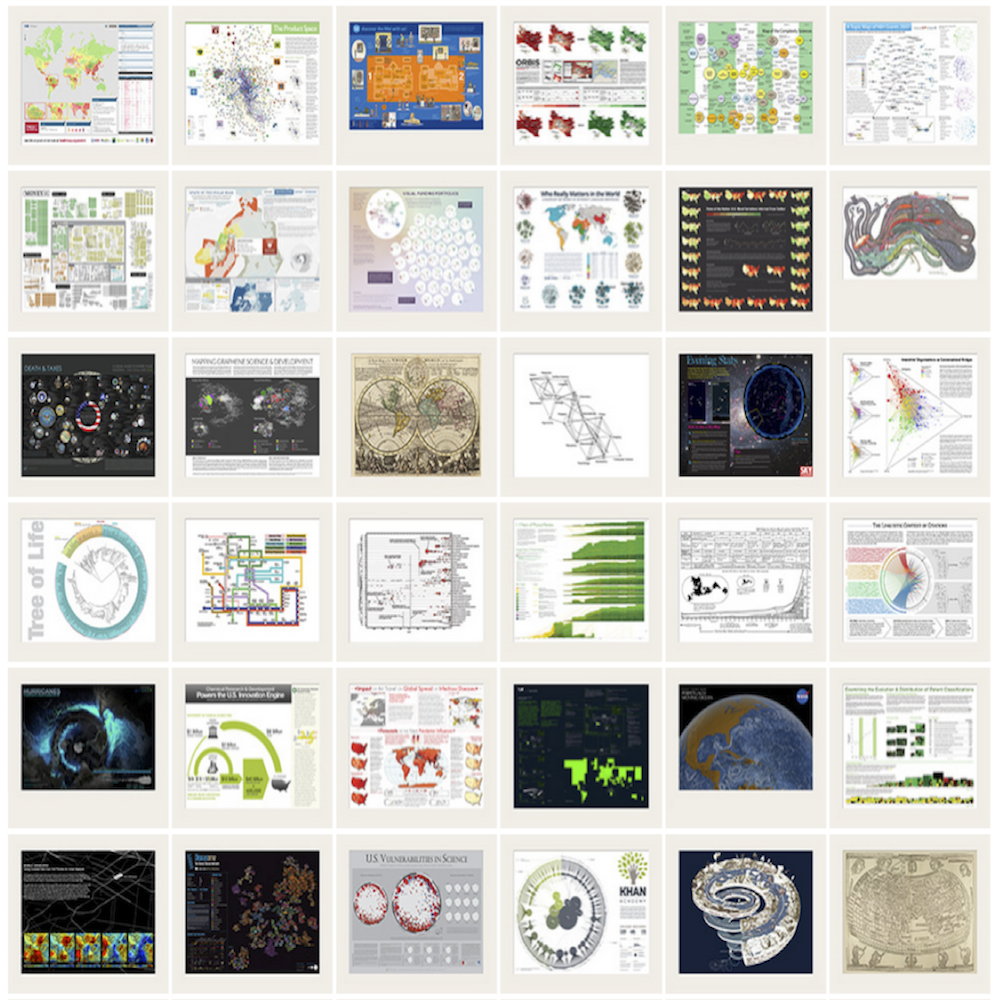
“Everything has become visual”, as one of my interviewees put it, and practices in the field of scientometrics are no exception. Scientometricians study dynamics in science itself with the help of quantitative methods. Studying visualisations in this specific discipline during my field research at the 2013 conference of the International Society of Scientometrics and Informetrics (ISSI conference 2013) I was thrilled by the extensive use of abstract data and its representation in colourful graphs, network diagrams and even interactive visualisations. Some of the images were cartograms or data layers on geographic maps. Even in cases where no geographic coordinates were integrated sometimes the term science map was used metaphorically, suggesting that abstract data from various scientific fields and statistical data about dynamics in science can be mapped to then guide its audience through some extract of the world out there.
Reasons for the popularity of science maps can be found in the widespread availability of visualisation software and their capacity to serve bibliometricians’ needs. This in parallel leads to immense participation of computer scientists at the ISSI conference. Representatives of many different disciplines use images as boundary objects to demonstrate their expertise, to convince their users, to seduce their audiences to take their data as finite. Multi-disciplinarity is enacted and power relations negotiated, with visualisations as gladiators in transepistemic arenas.
The imageability of these visualisations derives from various assumptions about their usage, be it to underline an argument, to visually enrich a slide show presentation or to enable deeper insights and faster understanding of one’s own data with publishing representations afterwards as findings, not necessarily as a product of serendipity. Often epistemic foundations are fragile and it could be advisable to accept and better acknowledge inherent multi-disciplinarity of the field itself and the necessary expertise for creating visualisations even at engagement and deployment state.
An intrinsic feature of the field is its deep entanglement with science policy making. In fact, bibliometric data often serves as evidence base for decision making and the visualisations analysed in my study in many cases were originally made for analyst reports to science policy decision makers.
Visualisation in scientometrics are performing in political environment because they form a colourful reality of an abstract construct that is a product of a long series of previous representation and translation steps and that has been elaborated due to a need for analytical evidence in decision making in science administration. Looking at this aspect behind the concept of performativity as John Law did in 2009 any attempt of picturing what we think is out there consequently is contributing to form what is out there. Hence we come to understand these images and social order as being co-produced.
This is not at all a claim against using visualisations, but to the implementation of reflexivity processes during their production, engagement and deployment. Even though colourful graphs might be visually appealing they are not simply decorative but serve as actors and should thus be discussed critically in their function. As shown by Klaus Amann and Karin Knorr-Cetina (1988), images cannot stand by themselves to provide unambiguous evidence, but should rather be treated as a starting point for discussion.
What does this mean for the scientometrics community? The specific role this discipline adheres to is deeply connected with how science is perceived in general. Based on statistics, science policies are negotiated, funding is distributed or even personnel decisions are made. Doing research about science opens possibilities to shape perceptions of what science is, and so do scientific visualisations about science, serving as mediators for statistical results.
Using visualisations in scientometrics is therefore an inherently political undertaking that is accompanied by certain obligations towards different audiences at stake. The question of responsibility, especially in the context of image deployment and the seductive mechanisms that come along with it, is certainly one that deserves further treatment.
.
Further reading and references
A similar approach was taken by Law (2009), who analysed the performativity of power point slides at a specific conference – Law, John. 2009. ‘Collateral Realities’. Department of Sociology, Lancaster University, Version of 29th December 2009, available here.
Amann, Klaus, and Karin Knorr-Cetina. 1988. ‘The Fixation of (visual) Evidence’. Human Studies 11 (2): 133–69.
Isabella E. Wagner is scientific project manager at the Centre for Social Innovation (ZSI, Vienna) where she is engaged in supporting international science collaboration as well as in conducting bibliometric studies. During her Masters in STS at the University of Vienna she dealt with the performativity of visualisations in the field of scientometrics in a thesis.